UI/UX Design in India: The Design Audit We'd Run in Week One
The UX audit we run in week one on Indian onboarding and checkout: KYC drop-off, UPI states, OTP friction, Indic language, accessibility and INR costs.

When an Indian product team asks us for a redesign, the first thing we usually propose is smaller: a one-week audit of the flows where money is lost, onboarding and checkout. In fintech, SaaS and commerce products across the country, those two flows decide most of the revenue, and they tend to fail in the same handful of ways.
This is the audit we run in week one.
Day 1: start from the funnel, not the screens
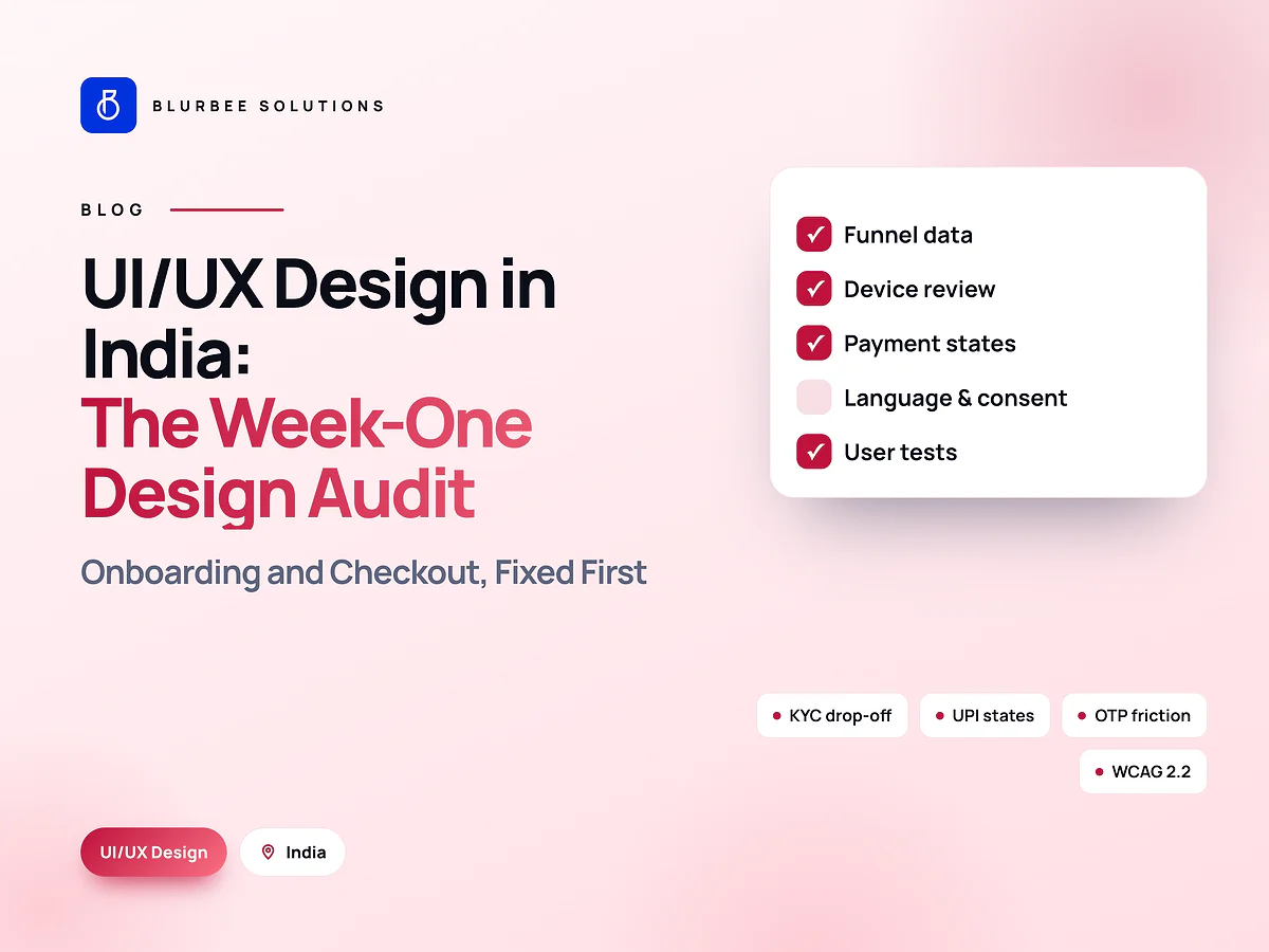
Before opening Figma, we read the analytics. For each key flow we map every step and its completion rate:
- Landing → sign-up → OTP verified → profile → KYC submitted → KYC approved → first transaction.
- Cart → address → payment method → payment confirmed → order placed.
The biggest drop between two steps is where we start. It sounds obvious, but many redesigns begin with the home page, where drop-off is lowest and evidence is weakest.
Day 2: heuristic review on real devices
We walk every key flow on the devices your users actually carry, typically mid-range and budget Android phones, on a throttled connection. Common findings in Indian products:
KYC asked too early. Users are asked for PAN, Aadhaar or document photos before they have seen any value. Moving KYC later, or splitting it, often lifts completion noticeably.
Document upload without guidance. No example photo, no framing guide, no clear reason for rejection. Users retry, fail and leave.
OTP friction. Short timeouts, no auto-read, no clear resend, and silent failures when SMS is delayed.
Long forms that lose data. A network drop wipes ten fields of input. Autosave fixes it.
Error messages that blame the user. "Invalid input" instead of "Enter your PAN as 5 letters, 4 numbers, 1 letter."
Day 3: payments and UPI states
UPI is the default payment method for many Indian users, and its UX lives in the transitions: from your app to the UPI app and back. We check every state:
- Success, with clear confirmation.
- Failure, with a reason and an obvious retry.
- Cancelled in the UPI app.
- Pending, which is common, with honest messaging and server-side status confirmation.
Unclear pending screens cause the worst outcomes: duplicate payments, panicked support calls and refunds. Baymard Institute's research puts average documented cart abandonment around 70%, and payment confusion is one of the avoidable reasons.
Day 4: language, consent and accessibility
Language. If users extend beyond metro English speakers, we check translated copy with real users, longer text in layouts, script rendering on budget phones and transliterated input in search and forms.
Consent. Under the DPDP Act, consent requests must be clear, specific and in plain language, with an easy way to withdraw. Bundled or pre-ticked consents are both a legal and a trust problem.
Accessibility. We check against WCAG 2.2, including target sizes and accessible authentication, which matters for OTP and CAPTCHA steps.
Day 5: test the worst step with users
We run short remote sessions with five to eight participants per key group, on their own phones, focused on the step with the biggest drop. That is enough to confirm what the data suggested and to find the problems the data could not show, such as users not trusting a screen or misreading a label.
What you receive
A ranked list of issues, each with:
- the evidence (data, recording or test observation);
- the proposed fix, with annotated screens;
- effort to implement;
- the expected effect on the funnel.
Quick wins are validated with users in week two where possible.
What it costs
A two-week audit of two or three key flows typically costs ₹1.5-4 lakh with us, depending on flows, platforms and languages, excluding GST. Fixes are priced separately once you know which ones matter.
A sample of what the audit report looks like
Each finding is written so a product manager can act on it the same day:
| Finding | Evidence | Fix | Effort |
|---|---|---|---|
| KYC asked before first value | 38% drop at KYC step; 4 of 6 users hesitated | Move KYC after first transaction preview | Medium |
| UPI pending shows a blank screen | Support tickets mention duplicate payments | Add pending state with status polling | Small |
| OTP resend hidden for 60 seconds | Users abandoned while waiting | Show countdown and resend clearly | Small |
| PAN error message unclear | Repeated failed submissions in recordings | Explain the expected format inline | Small |
The numbers in this example are illustrative. Yours come from your funnel data and your users.
Start with the leakiest step
Most products gain more from fixing five or six high-impact problems than from a redesign. Start with the audit, fix what the evidence says, then decide whether anything bigger is needed. For design systems that keep fixes consistent, see design systems that survive a rebrand; for Bengaluru-specific design work, see hiring a UI/UX agency in Bengaluru.
UX in Indian products, in numbers
Blurbee's assessment of the most common drop-off points across fintech, SaaS and commerce audits, share of issues found. Indicative, not a survey.
Why Indian product teams audit UX with Blurbee
We audit with your funnel data and real users on the phones your customers carry, then rank fixes by revenue at stake. Most of the gain usually comes from five or six changes, not a redesign.
- Fixed-scope first projectTwo to four weeks, priced as a number rather than an estimate, so you have evidence before a longer commitment.
- One delivery lead, namedYou always know who to ask. No account manager relaying questions to a team you never meet.
- Code and IP are yoursAssigned in writing, handed over with repositories, infrastructure definitions and documentation whether or not you continue with us.
- Performance budgets in CICore Web Vitals and bundle size gate the build. Slow does not ship.
- Accessibility to WCAG 2.2 AAReviewed with automated and manual passes, not claimed on a slide.
- Written overlap disciplineStanding calls inside your working window, everything else asynchronous with a decision log.